Color
“Color is very much about atmosphere and emotion and the feel of a place.”
Alex Webb

Color
In visual storytelling, color is never just decoration, it’s language. It’s mood. It’s intention.
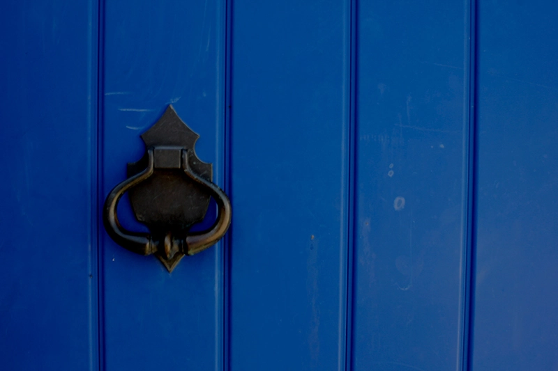
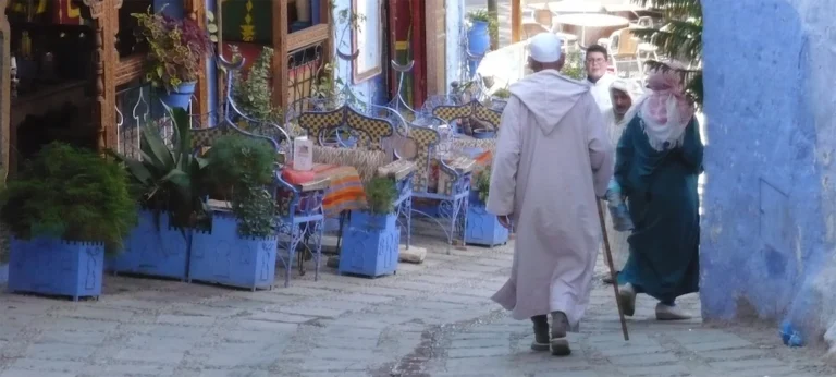
Color has the power to shape the emotional weight of an image long before form or subject even register. Reds and oranges evoke heat, urgency, even danger, they demand attention. Blues and greens, by contrast, soothe us, drawing us inward like the hush of deep water or the calm of a forest after rain. Yellows warm the frame with light, the gentle glow of a sunrise, or the golden intimacy of candlelight.
As a cinematographer and photographer, I use color the way a composer uses sound, to guide the emotional rhythm of an image. With intention and restraint, a single dominant color can become the visual heartbeat of a shot. When used carefully, color directs the eye and amplifies meaning. When misused, when multiple hues compete without harmony. It confuses, scatters attention, and dilutes impact.
Sometimes, creating a powerful image means stepping closer, changing the angle, or isolating a detail. Whether through a long lens or the movement of your body, simplifying the color palette often strengthens the story. When we reduce distraction, we allow color to speak more clearly and what it says can be unforgettable.
For me, color isn’t just part of the image.
It is the emotion of the image.
“Ready to turn your project into a visual journey?
BE CONNECTED. BE CREATIVE. BE INSPIRED.
Let’s create something extraordinary.”


